
Since I recently posted a tour of our house, I thought this would be the perfect time to talk about paint colors. I love it when bloggers I follow share their paint color brands and names (go check out dear lillie's paint colors, they're awesome!). There's nothing better than seeing the way a paint color looks in someone's home as opposed to seeing it in the color sample book at the store.
Now bear with me (yes, it's bear not bare) because I'm not home to take close up pictures of the paint colors. I'm gonna use photos I already have on my laptop.
The majority of the paint I used was Benjamin Moore. It is hands down my first choice for paint. I love their historical collection. Okay, who am I kidding, I love all the collections. Some people claim it's a little more expensive, but I think it is comparable to Behr, and it's worth the price. Here is a list of the Benjamin Moore colors I used, including the collection to which they belong:
My Bedroom & The Downstairs Bathroom:
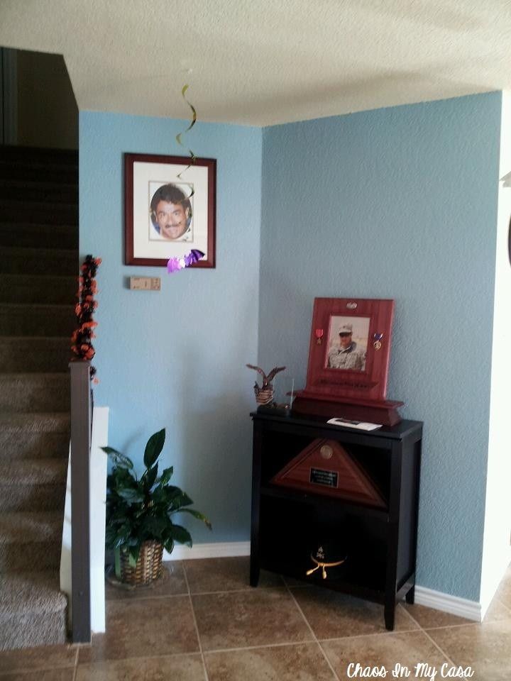
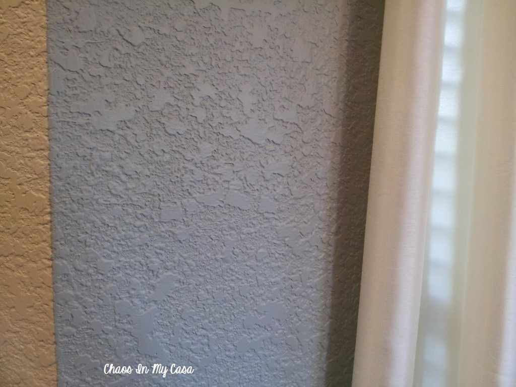
Historical Collection-Palladian Blue
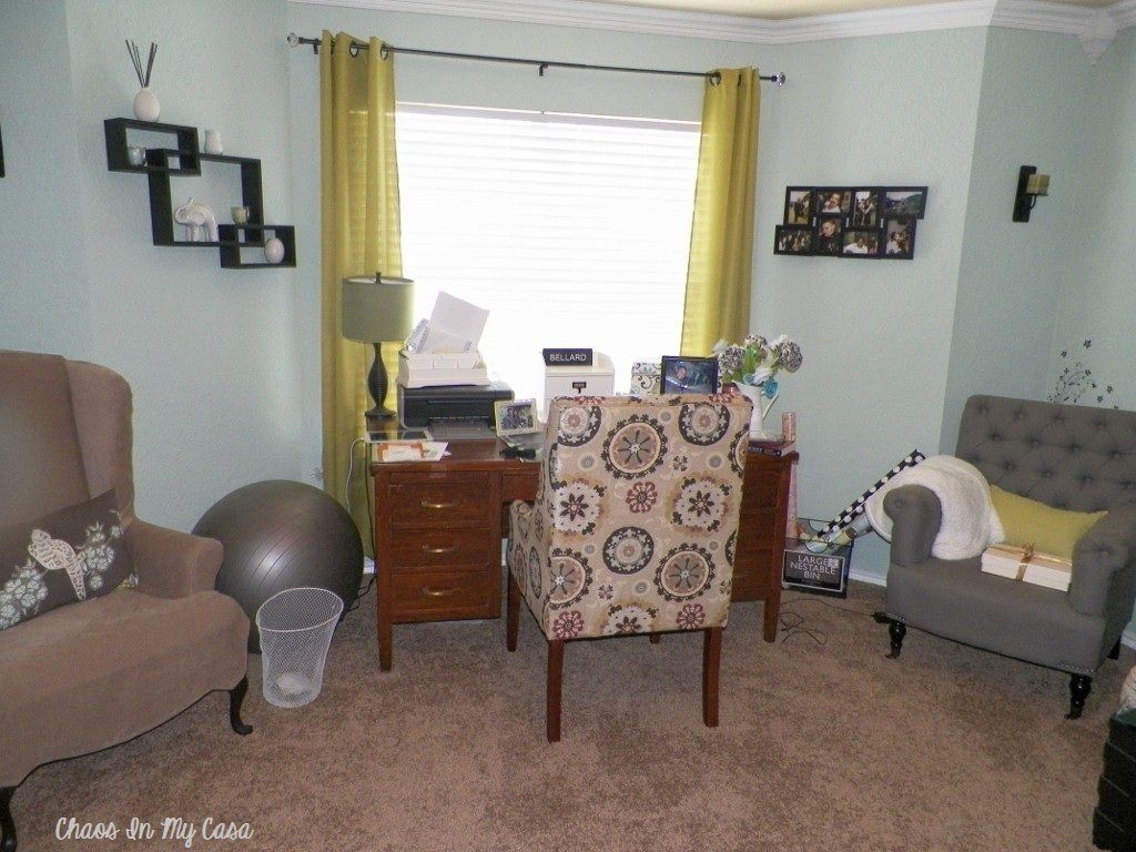

The website describes it as a mix of sky blue and mother of pearl. I'd say that description is right on. I wanted a soothing color for my bedroom and was thrilled that I had enough leftover paint to use in the small half bath downstairs.
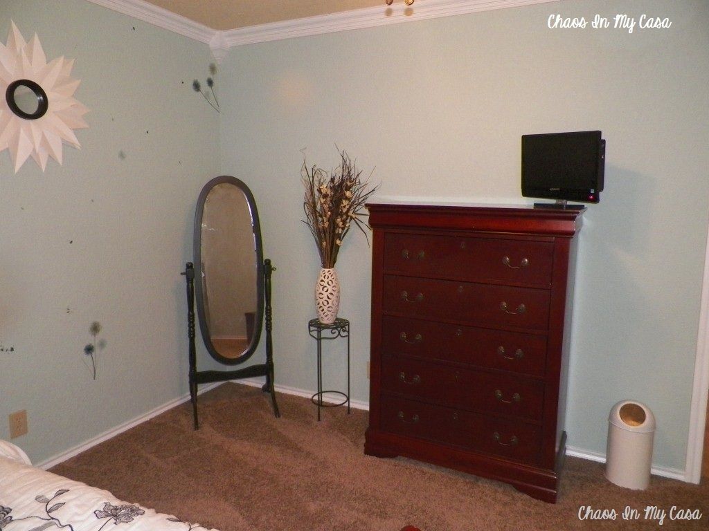
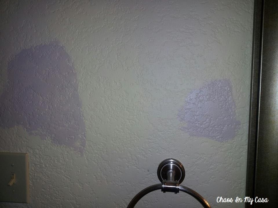
Downstairs Bath:
I apologize because I must have taken these pictures at night so the lighting isn't all that great, but I wanted you to see what the color looked like in a smaller space with no natural light.

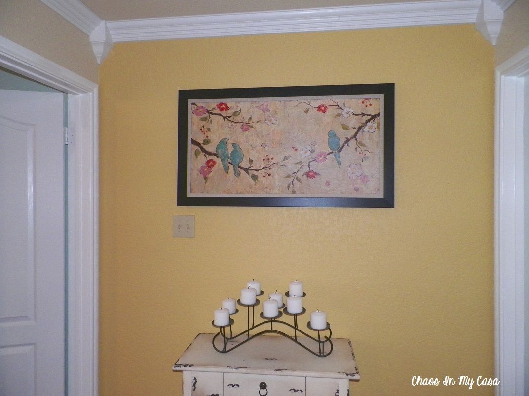
Kitchen & Staircase Accent Wall:
Classic Collection-Gold Leaf

Even though my kitchen is large, it feels small because of all the odd angles, so I knew I wanted to go with a light, cheerful color that would make the space feel larger. I've always been a fan of yellow kitchens, and decided that I would pull the wall color out of the colors in the granite countertops.
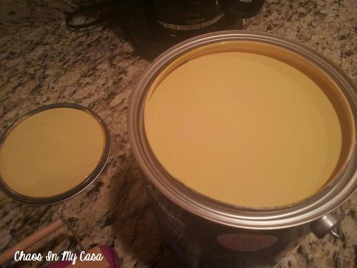
There are several gold tones in the granite so I used the Benjamin Moore Color Capture app on my phone. All I had to do was take a picture of the counter using the app, scroll over the picture wherever I saw the gold tones I wanted, and it would tell me which Benjamin Moore color matched.
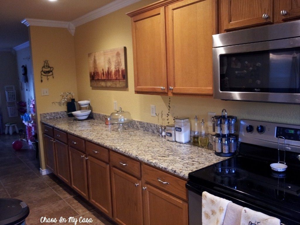

(This is an older picture. You can tell because I was in the process of installing hardware on the cabinets...oh the memories, NOT! It was such a pain.)

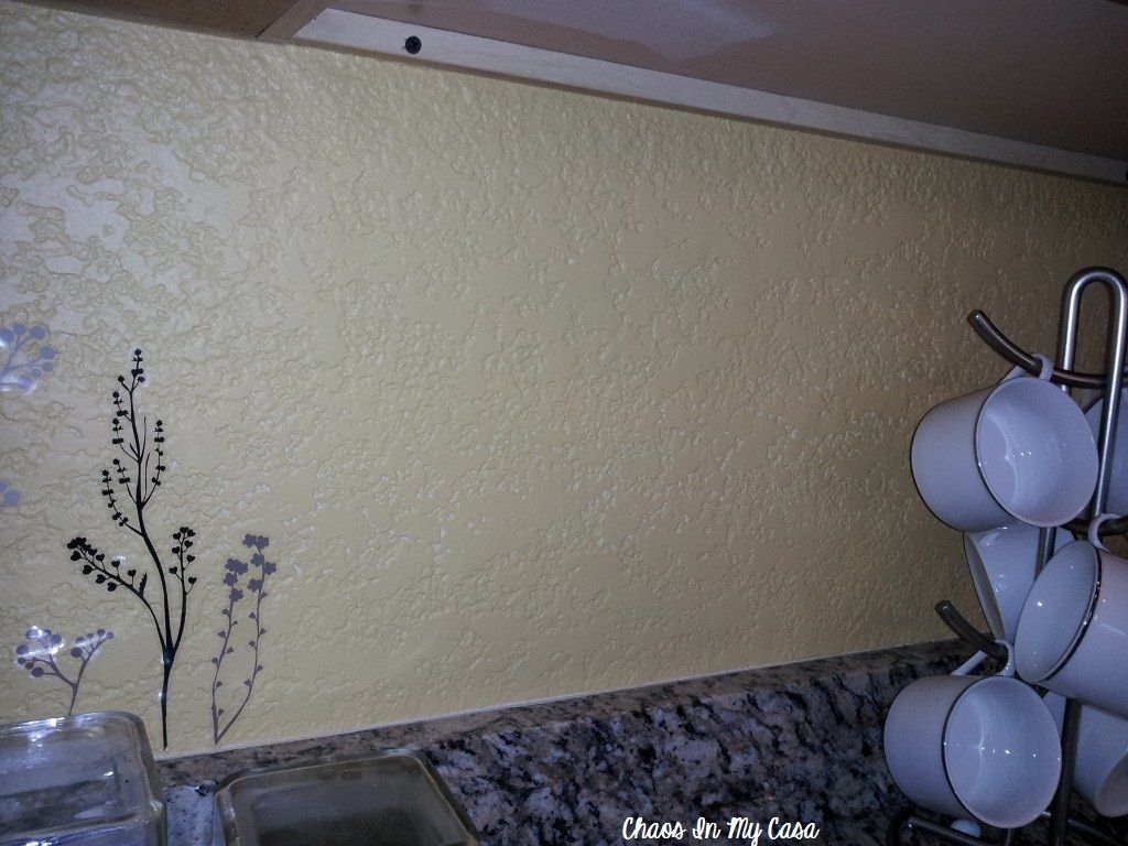
and a close up:
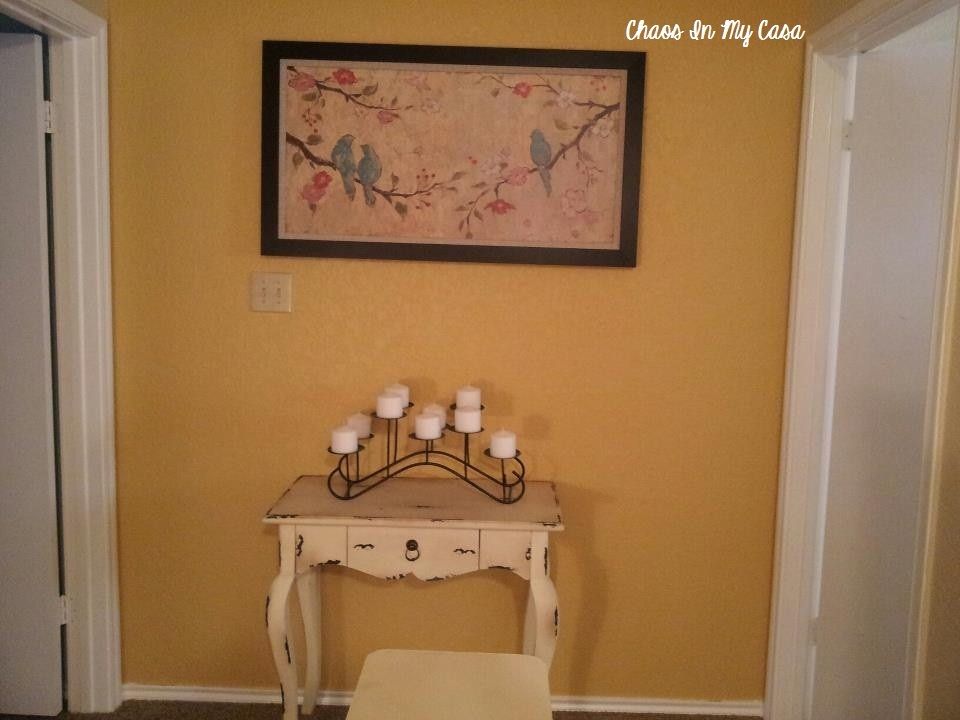
Accent Wall:
I once again had a small amount of paint left over, so I used it to change the wall at the top of the stairs. The color looks much darker because there are no windows in the upstairs hallway (which I hate). Without natural light, the color takes on a deeper tone.
Guest Bedroom:
Affinity Collection-Azores
When I purchased my home, my sister was staying with me to help me get settled in, so I designated the guest bedroom as her room. She chose her own paint color and bedding. The color she chose is a beautiful blue-green.

Even though my sister moved back to Alaska, I have left the paint color alone. I think it's a nice shade for the guest room.
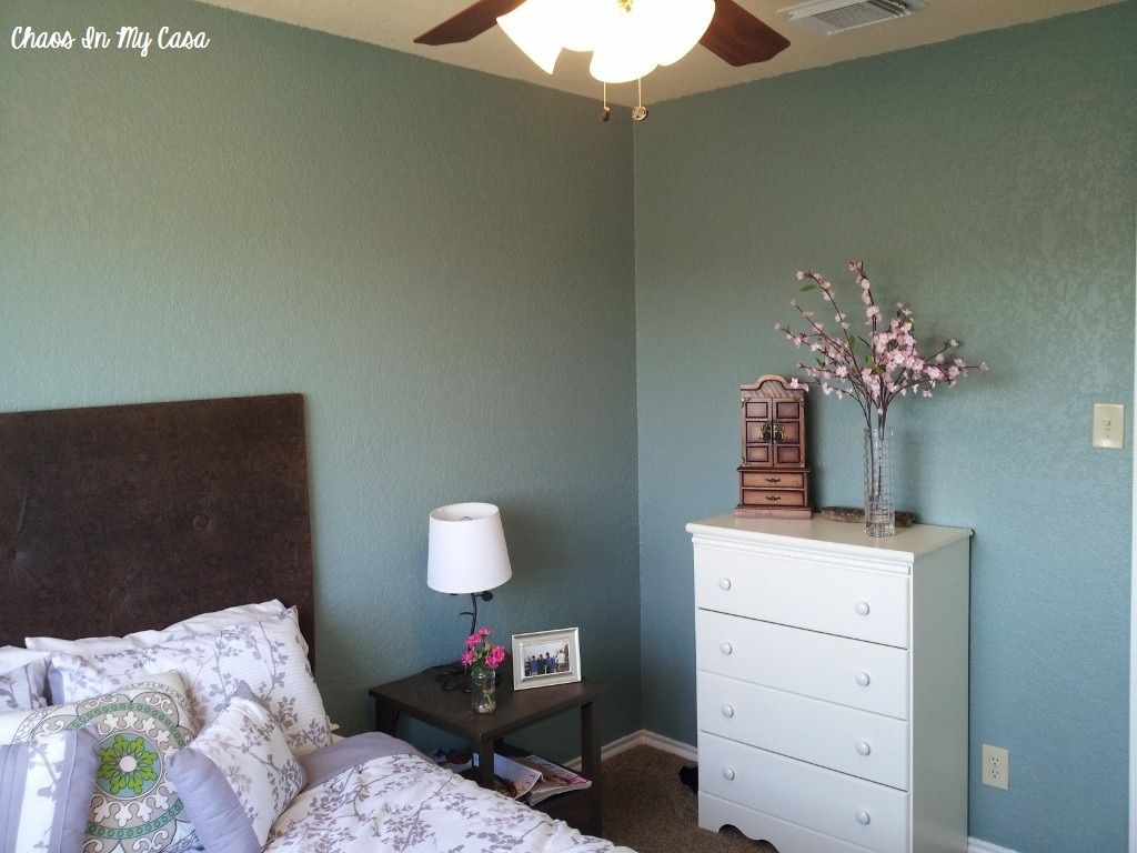
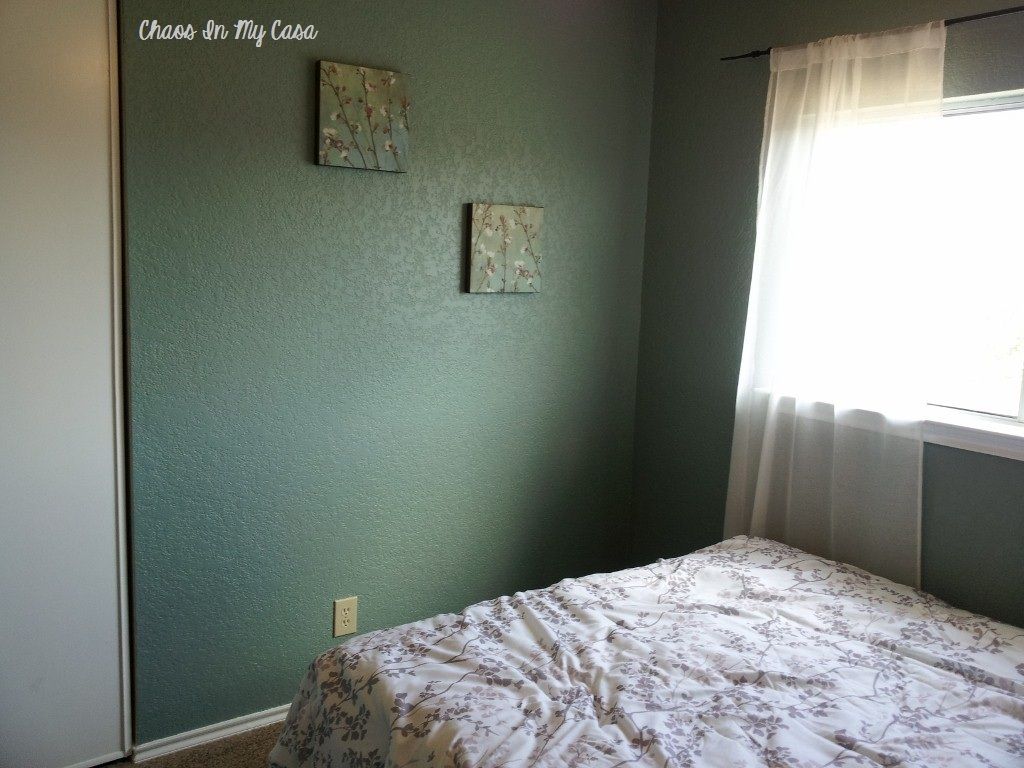
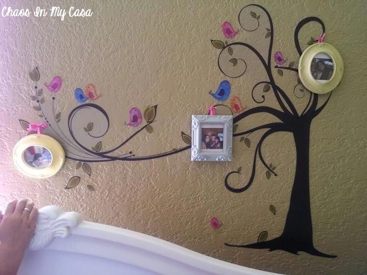
Eva's Bedroom:
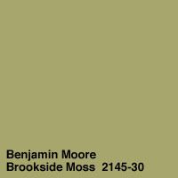
Color Preview Collection-Brookside Moss
Eva's bedding has these bright, beautiful colors in it, so I knew I wanted to choose a shade of green that would give it a Spring feel.
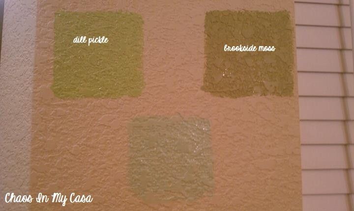
I picked those three shades from tons of greens. I loved all three. The bottom color was too light and would need several coats. I initially went with Dill Pickle, but changed my mind at the last minute out of fear that the room would look lime green.
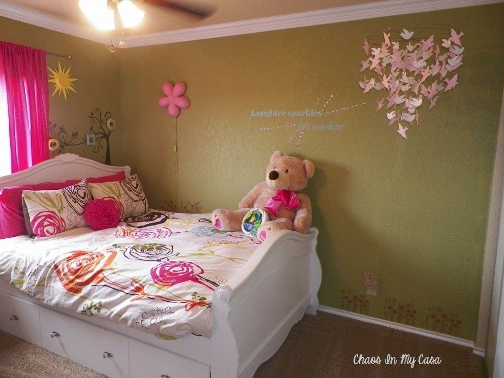
Even though I love Brookside Moss, if I had it to do over again, I would go with Dill Pickle. There's very little natural light in Eva's room because it only has one window, so the walls look too dark. I'm sure I'll end up changing it eventually, but for now it's okay.
Living Room:
Historical Collection-Buxton Blue

While looking for a blue for my bedroom, I came across Buxton Blue and fell in love. Since my living room isn't a normal-shaped room with four walls, I knew I would use it for an accent wall. I started by painting the main wall behind the fireplace
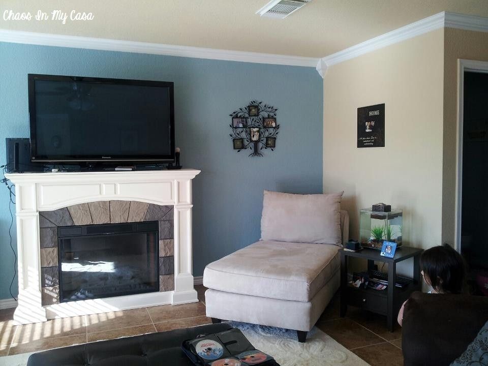
then I decided to paint the nook opposite the wall as well:
Laundry Room:
I had wanted to do a black, white, grey, yellow color scheme for the longest time. I found Egg Yolk by Martha Stewart at Home Depot, but they no longer carried her paint, so they mixed it in Glidden.
Stripes:

Glidden: Martha Stewart Egg Yolk

Glidden: White
The white is just a plain white that they carry in bulk there. It was left over by the house flipper who owned the house before me.
Shelves:
Behr: Sage Gray

I had a small sample of Sage Gray left from the samples I had bought for the dining room. I think it's kind of a gunmetal gray color. It was exactly what I had envisioned for the shelves and I saved money by using one of my old samples.

Guest Bedroom 2 & Breakfast Nook:
Behr: Verdigris

When I went to Home Depot to look for paint samples for this room, I walked past the Behr color swatches and this color caught my eye. It was precisely what I had in mind...a greenish gray that would be soft enough for a dining area. It even says it in the name...verdi (green), gris (gray).
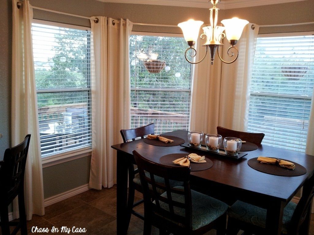
I loved it so much that I painted the ex-office the same color.


I thought this color was really soothing, I would use it in a restroom to achieve that spa feel (if I had another bathroom to paint).
Master Bathroom:
Glidden: Cafe Latte
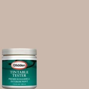
From left to right: Sage gray, Egg Yolk, and Cafe Latte:
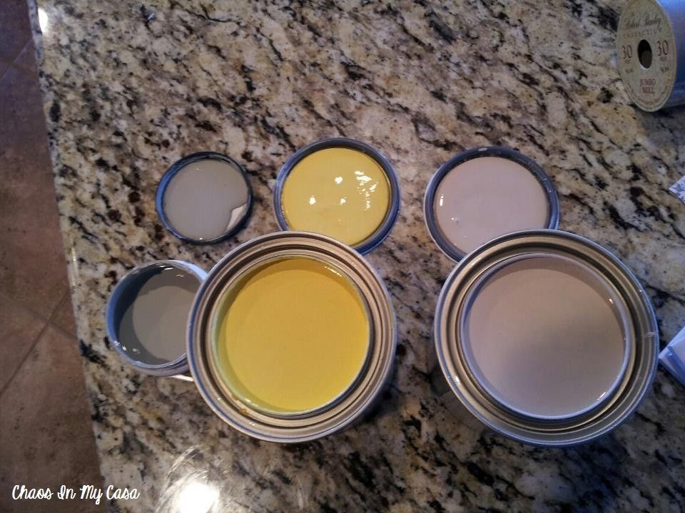
My master bath has gold and brown in the granite counters, floor tiles, bath tiles, etc... The entire room is a weird off-white beige-ish color, and all together that makes for a very bland room, so I decided to paint an accent wall behind the double vanity to break up the monotony. I wanted a soft shade that would counteract the darker brown in all the tiles, so I went with this soft latte color. I have yet to finish painting the wall, but that's what the sample looks like on the wall.
I won't get into all of the sheen options for paint, because that's a whole other subject, but I will say that I went with a satin finish for the bedroom colors so that they would reflect light nicely without being too glossy. I used an eggshell finish for the kitchen and breakfast nook since eggshell is durable, has less of a sheen, and is easy to clean.
You'll notice that I reused a lot of my paint colors. I did that for two reasons, the first being that I had a lot of left over paint (duh), and the second is that I think it gives the rooms more of a cohesiveness. I hate walking into houses where every.single.room. is a completely different color and none of the colors flow. It's too disjointed.
On the other hand, I also used to think that it would be nice to move into a house that was completely beige and neutral... until I became a home owner. The entire interior of my house was the same color and it was too bland. I started experimenting with color and really prefer the way it looks now.
So what do you think? Can you ever have too many colors in one home or do you like seeing a varied color palette?
Hi Veronica,
ReplyDeleteI would like to know what color compliments the Buxton Blue in your living room as pictured above. Thank you!