
....or as I like to call it, Mission Impossible!
That's right, that's the defeatist attitude I had after days of looking at paint swatches and trying out paint samples...five or six paint samples! Yikes! This was so unlike me. I usually know what color I want to paint a room before I even get started. Let me backtrack...I thought I knew what color I wanted. Remember my dining room olioboard? I shared this photo:

It's from Martha Stewart's site, they call it Purple Gray, and list it as a "Sophisticated Neutral" Don't ask me why, but I fell in love with it. It's so beautiful, feminine, and regal feeling. It's so strange for me to be attracted to this color because purple is one of my least favorite colors. I just HAD TO HAVE IT. Then I researched it and found there were people just like me who wanted this color....except it DOESN'T EXIST! WHAAAAAT?????!!!! After looking it up at Home Depot and online (and finding nothing), I discovered that someone contacted Martha Stewart's people to inquire about it and they were told the reason it's not available online or in stores is because they just mixed some colors to come up with it for the photo, it's not one of her official colors. Can you say bummer?
So that sucked, but I decided just to look to Benjamin Moore (he never lets me down) to find something similar. How hard could it be, right? WRONG. Benjamin Moore has too many beautiful paint colors and their shades of gray (hee hee) are never ending.
So I picked out swatches and bought three paint samples: Antique Pearl, Hint of Violet, and Thunder. I figured I should cover all the bases, so I chose a super light shade, a medium color, and a dark gray. Then I put them on the walls and asked my Facebook peeps to vote their fave.
(left to right: Antique Pearl, Hint of Violet, Thunder):
(left to right: Antique Pearl, Hint of Violet, Thunder):
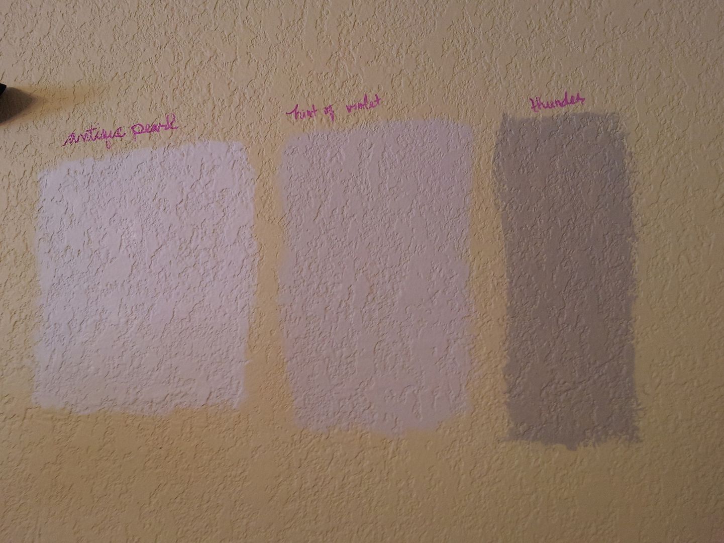
I was leaning towards the middle color: Hint of Violet. It looks like a soft lilac. Antique Pearl was pretty but way too white. Surprisingly, the majority of the people who voted wanted Thunder (the darkest color). I liked the color too but had never really considered going that dark in this room since it's still going to be Eva's toyroom.
I walked around, I looked at the samples from every angle in the room. I pondered....and decided that none of the colors was quite right. While Hint of Violet was beautiful, did I really want an entire lilac room? It's more like something I would paint a little girl's room. Then I decided to mix equal parts Thunder and Hint of Violet, and threw in a tiny bit of Antique Pearl to come up with what I dubbed "The Ménage à trois baby:"
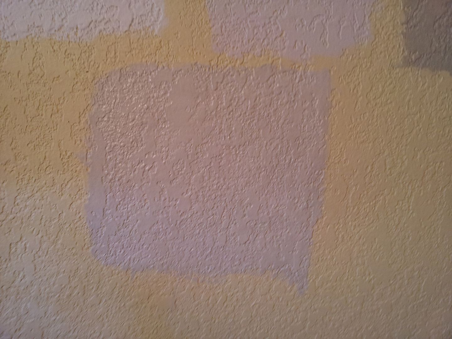
Here's a zoomed out pic so you can compare it with the others:
(it's on the bottom)
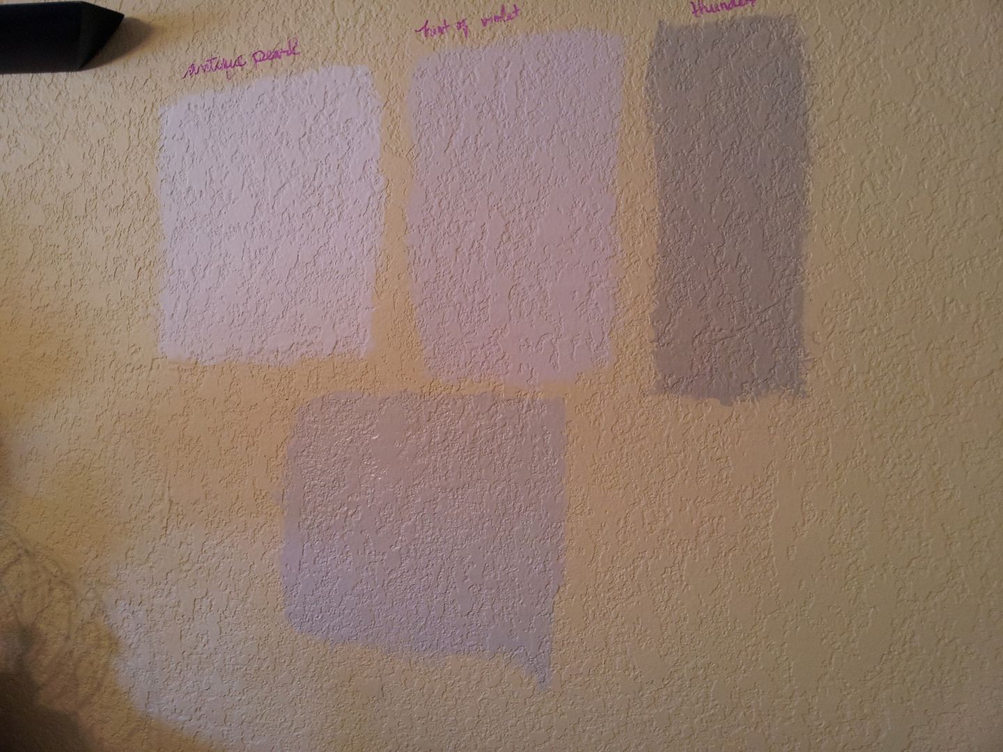
(it's on the bottom)
Surprisingly, I actually liked the color. Just one problem, I've never really mixed paints before and I would be mixing on a much larger scale to cover the whole room. I opted to sleep on it. The next morning I decided the mix wasn't quite right either, so I got back online to look at more gray colors.
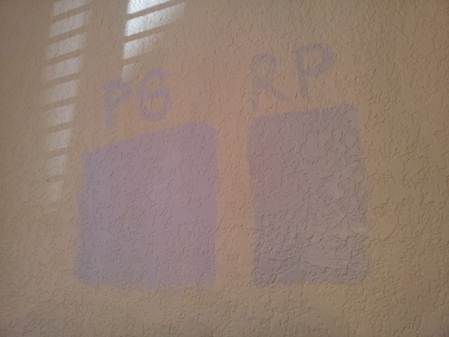
I came across Portland Gray (one of Candice Olson's fave Benjamin Moore Designer picks). Online it looked like the perfect shade of medium gray with just a hint of purple. I ventured out to the paint store once more, feeling confident I'd found the perfect color, and picked up a sample of it along with a sample of Revere Pewter (one of my fave shades of gray). I put the samples up on the wall and liked what I saw, so I submitted it for votes on FB again.
At this point I think my FB friends all wanted to choke me for inundating my FB with paint sample images.
I called my sister in AK to discuss Portland Gray...as it dried, it was looking very lavender. She said it definitely looked very purple in the picture but it was a nice color. After we hung up I fretted. Why was I having such a hard time choosing a color? I loved Revere Pewter but it was just a plain gray, I was stuck on the idea of finding the perfect shade of confused purple gray. I looked online to see if I could find any other pictures of Portland Gray. Maybe mine just hadn't been mixed correctly. Then I came across another blog, I wish now I could remember what it was called. In the post, the author displayed an entire room she had painted Portland Gray. It looked lavender, just like mine. She hated it and wound up repainting it...the.whole.room. I knew I didn't want to end up the same way, so I decided to ditch Portland Gray. This meant starting the search over again. I wanted to call it quits right about then. Actually I'm getting irritated just retelling the story!
So I went back online and looked at at least fifty more shades of gray (sorry, couldn't help it). I finally decided on Himalayan Trek.
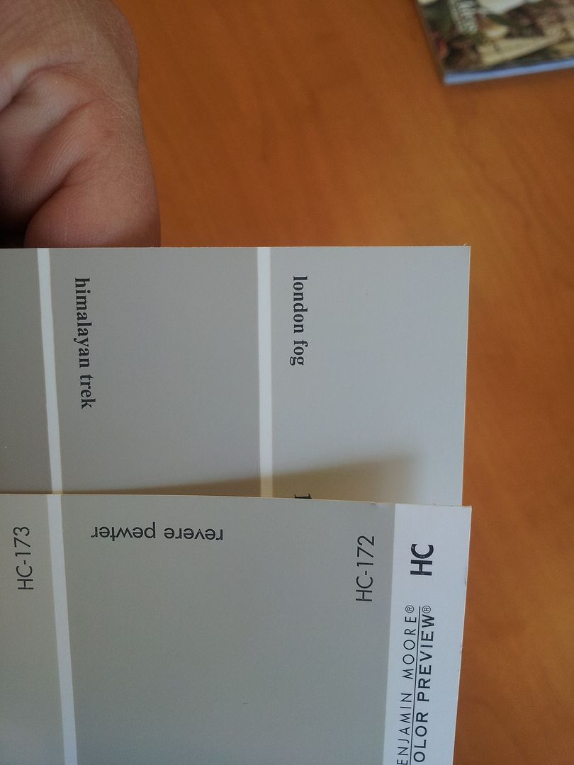
It's a beautiful taupe-y gray. I had seen it before since it's supposed to be similar to Thunder, but ignored it thinking it would be too dark.
So I went to the paint store and bought a gallon of it...no more samples, I was gonna take the plunge. At $53 a gallon, it was staying up regardless of whether I liked it or not.
So I painted a patch of wall with it directly above my other samples

and I freakedthe F out.
It looked just as dark as Thunder. Holy $%!# what was I thinking buying a whole gallon of it? Oh well, too late. So I painted the entry wall and two dining walls with it, leaving the last wall unpainted since I was going to do a stripe treatment on it and I hadn't decided what other color I would be using along with Himalayan Trek.
I did two coats and let it dry, then I hung everything back up....and I loved it! Hallelujah!
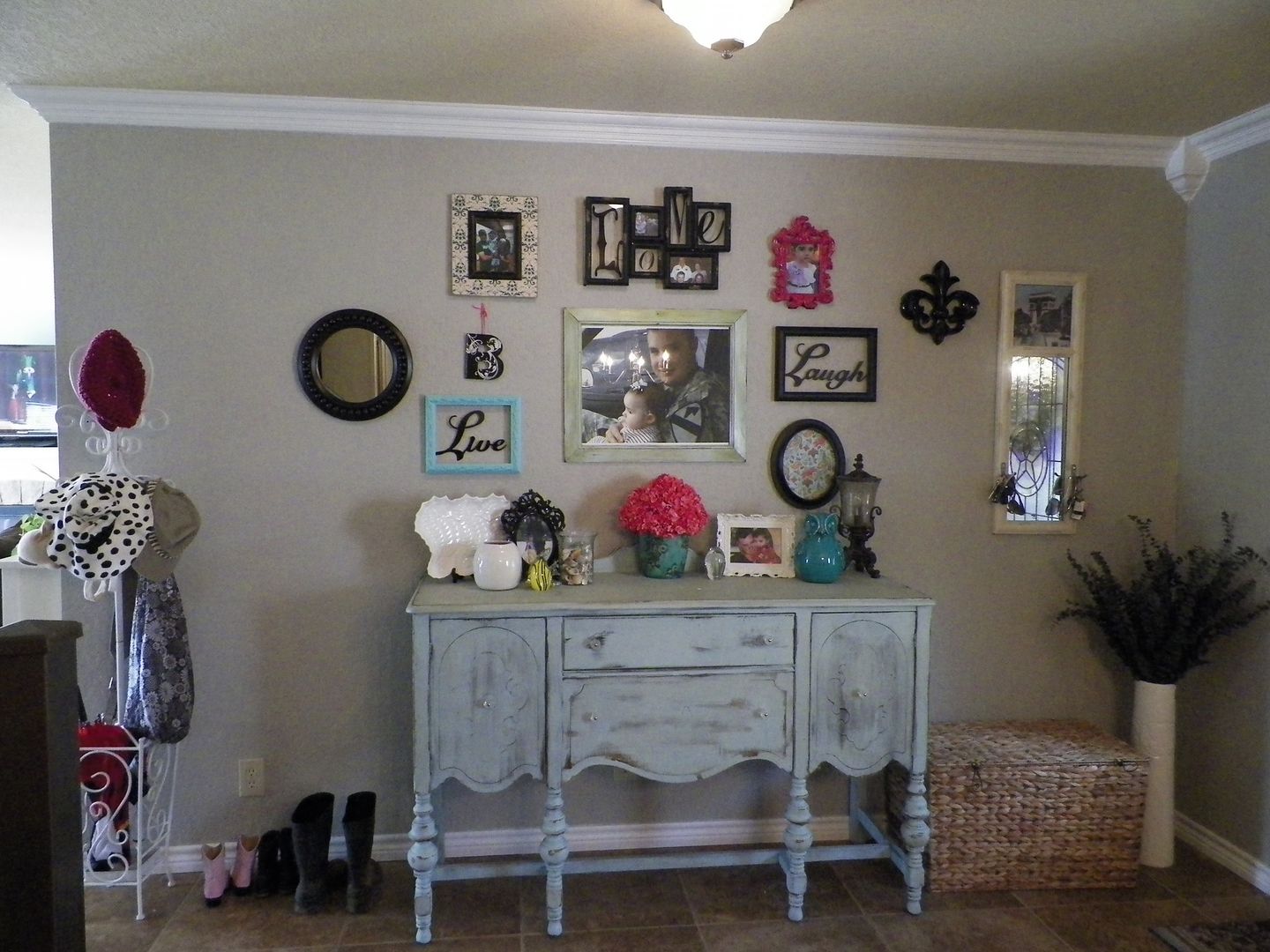
(sorry for the dark picture, we don't get much natural light on this side of the house)
It's definitely darker than I originally planned and it's nothing like the original Martha Stewart Purple Gray I wanted, but it works.
Next up was picking the color I would use for the stripes. I didn't want to do white stripes since I think using two completely different colors looks too severe. I considered using Hint of Violet so that I could still have that little bit of lilac in the room. Then I decided against it. If this lilac obsession turns out to be a quick phase I'm going through, I will end up hating it later. So I went the safe route and chose Revere Pewter.
Here it is on the wall (I'm starting to paint the stripes).
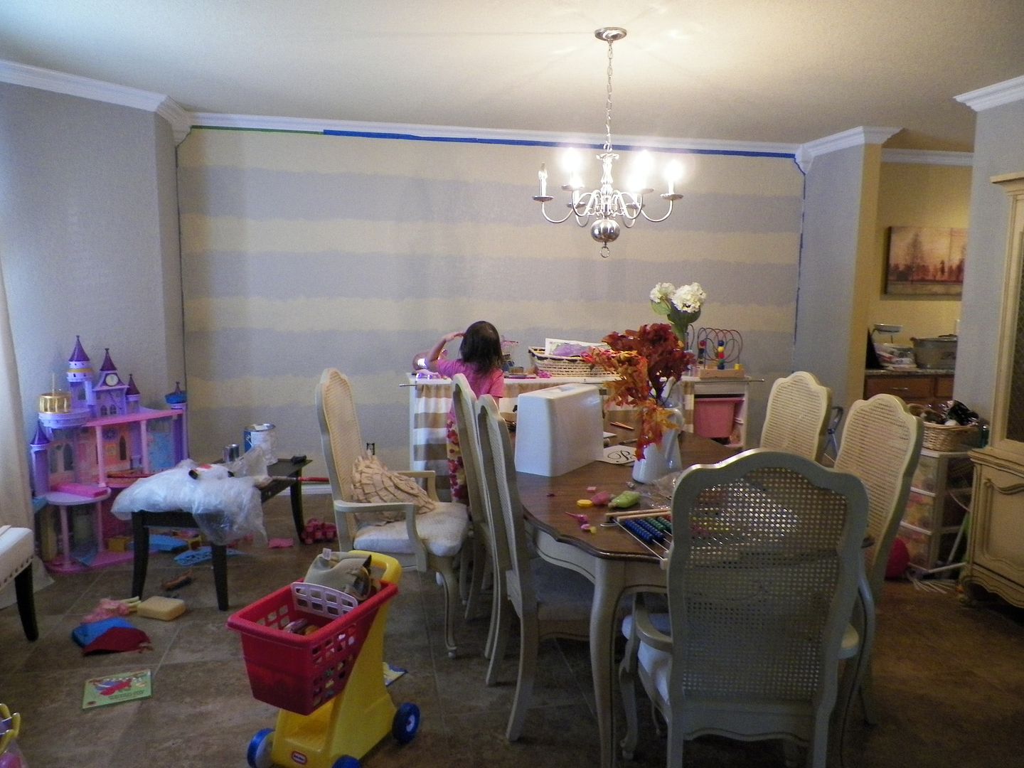
Yes, my house gets that messy when I paint. I didn't bother painting perfect stripes because I still have to tape over a little to paint my Himalayan Trek stripes.
Hopefully I will have a finished striped accent wall to show you soon.
So what is the lesson in all of this? Choosing the perfect shade of gray is tricky. I thought choosing the perfect gold tone was hard, but this is much more difficult. So here's a tip, if you're wanting to choose a gray for your home, decided first if you want a true gray, taupe gray, green gray, purple gray, blue gray, silver gray, greige (grayish beige), etc... you get the picture. There are so many options out there. If you go out not knowing quite what you want, you might have as hard a time making a decision as I did. Trust me, even if you decide you want a greenish gray, there are still hundreds of greenish grays to choose from, but at least you've narrowed it down some.
I called my sister in AK to discuss Portland Gray...as it dried, it was looking very lavender. She said it definitely looked very purple in the picture but it was a nice color. After we hung up I fretted. Why was I having such a hard time choosing a color? I loved Revere Pewter but it was just a plain gray, I was stuck on the idea of finding the perfect shade of confused purple gray. I looked online to see if I could find any other pictures of Portland Gray. Maybe mine just hadn't been mixed correctly. Then I came across another blog, I wish now I could remember what it was called. In the post, the author displayed an entire room she had painted Portland Gray. It looked lavender, just like mine. She hated it and wound up repainting it...the.whole.room. I knew I didn't want to end up the same way, so I decided to ditch Portland Gray. This meant starting the search over again. I wanted to call it quits right about then. Actually I'm getting irritated just retelling the story!
So I went back online and looked at at least fifty more shades of gray (sorry, couldn't help it). I finally decided on Himalayan Trek.
It's a beautiful taupe-y gray. I had seen it before since it's supposed to be similar to Thunder, but ignored it thinking it would be too dark.
So I went to the paint store and bought a gallon of it...no more samples, I was gonna take the plunge. At $53 a gallon, it was staying up regardless of whether I liked it or not.
So I painted a patch of wall with it directly above my other samples
and I freaked
It looked just as dark as Thunder. Holy $%!# what was I thinking buying a whole gallon of it? Oh well, too late. So I painted the entry wall and two dining walls with it, leaving the last wall unpainted since I was going to do a stripe treatment on it and I hadn't decided what other color I would be using along with Himalayan Trek.
I did two coats and let it dry, then I hung everything back up....and I loved it! Hallelujah!
(sorry for the dark picture, we don't get much natural light on this side of the house)
It's definitely darker than I originally planned and it's nothing like the original Martha Stewart Purple Gray I wanted, but it works.
Next up was picking the color I would use for the stripes. I didn't want to do white stripes since I think using two completely different colors looks too severe. I considered using Hint of Violet so that I could still have that little bit of lilac in the room. Then I decided against it. If this lilac obsession turns out to be a quick phase I'm going through, I will end up hating it later. So I went the safe route and chose Revere Pewter.
Here it is on the wall (I'm starting to paint the stripes).
Yes, my house gets that messy when I paint. I didn't bother painting perfect stripes because I still have to tape over a little to paint my Himalayan Trek stripes.
Hopefully I will have a finished striped accent wall to show you soon.
So what is the lesson in all of this? Choosing the perfect shade of gray is tricky. I thought choosing the perfect gold tone was hard, but this is much more difficult. So here's a tip, if you're wanting to choose a gray for your home, decided first if you want a true gray, taupe gray, green gray, purple gray, blue gray, silver gray, greige (grayish beige), etc... you get the picture. There are so many options out there. If you go out not knowing quite what you want, you might have as hard a time making a decision as I did. Trust me, even if you decide you want a greenish gray, there are still hundreds of greenish grays to choose from, but at least you've narrowed it down some.
Thank you for the painstaking detail of your trek to BM Himalayan! I am in the same quandary vis a vis my bedroom wall color. Trim is already painted SW Creamy. I too want the perfect purple gray without ever looking and it and thinking it is purple. As for as lavender, i loathe and fear it. Yet that MS color is sooooo luminous and beautiful and really appeals. Alas, I've made it to Himalayan Trek myself after many many hours logged and and am currently torn between that and Cape Hatteras Sand. They are very similar. We shall see!
ReplyDeleteThanks! I'm glad my crazy ramblings helped :) Cape Hatteras Sand is a beautiful color and is actually listed as a similar shade to Thunder (one of the samples I painted above). You can't go wrong with either color, good luck!
DeleteThanks for saving me from Portland Gray! I had no idea others had embarked on the same quest (the first time I saw the MS color was your post, but yep that's what I've been hunting for). Any chance you tried/eliminated Behr Burnished Clay or Olympic Albatross?
ReplyDeleteThanks for your comment! Sorry, I never tried those colors, but they are both really pretty. Good luck with the hunt. I know how difficult it can be. "#thestruggleisreal :)
DeleteThanks so much. I have had great trouble finding a pic of a Portland Gray room, and this post was so helpful!
ReplyDeleteSo glad it was helpful! Portland Gray is beautiful, but I feel like it's misleading online. In person, it is a very lavender gray.
DeleteYou're welcome :)
ReplyDeleteHave you looked at af-665 angelica?
ReplyDeleteHi, no, unfortunately I had never come across that color before. The Benjamin Moore site lists it as being similar to portland gray, which was one of the colors I did try.
DeleteI know this post is WAY old, but wanted to offer my two cents, as I've been searching for the perfect grey for my bedroom. The ultimate paint colour you get really depends on the surface you paint it on and I'm thinking the gold tone underneath those swatches made the colours look way more purple/violet than they actually are. I learned that the hard way after painting about 20 different swatches on a yellow-toned wall surface - everything came up super blue or lilac (and totally unlike the swatch colours). My solution is to test colours on white poster board and prime my walls before applying my final colour choice so the underlying colour doesn't affect the true colour. It's an annoying step to do, but I think it's worth it and now I know from experience what to do the next time. Right now, I'm trying to decide on BM Abalone and Barren Plain - both grey/greige tones with subtle violet undertones. Trial and error!
ReplyDeleteMy guess is that the color is Farrow-Ball's Elephant Breath?
ReplyDelete